Inquire NOw
let's work together
LAURA SNYDER
serving small businesses throughout the U.S.
Based in Southern New Jersey
Karly Rae, RDN Nutrition & Dietetics Website

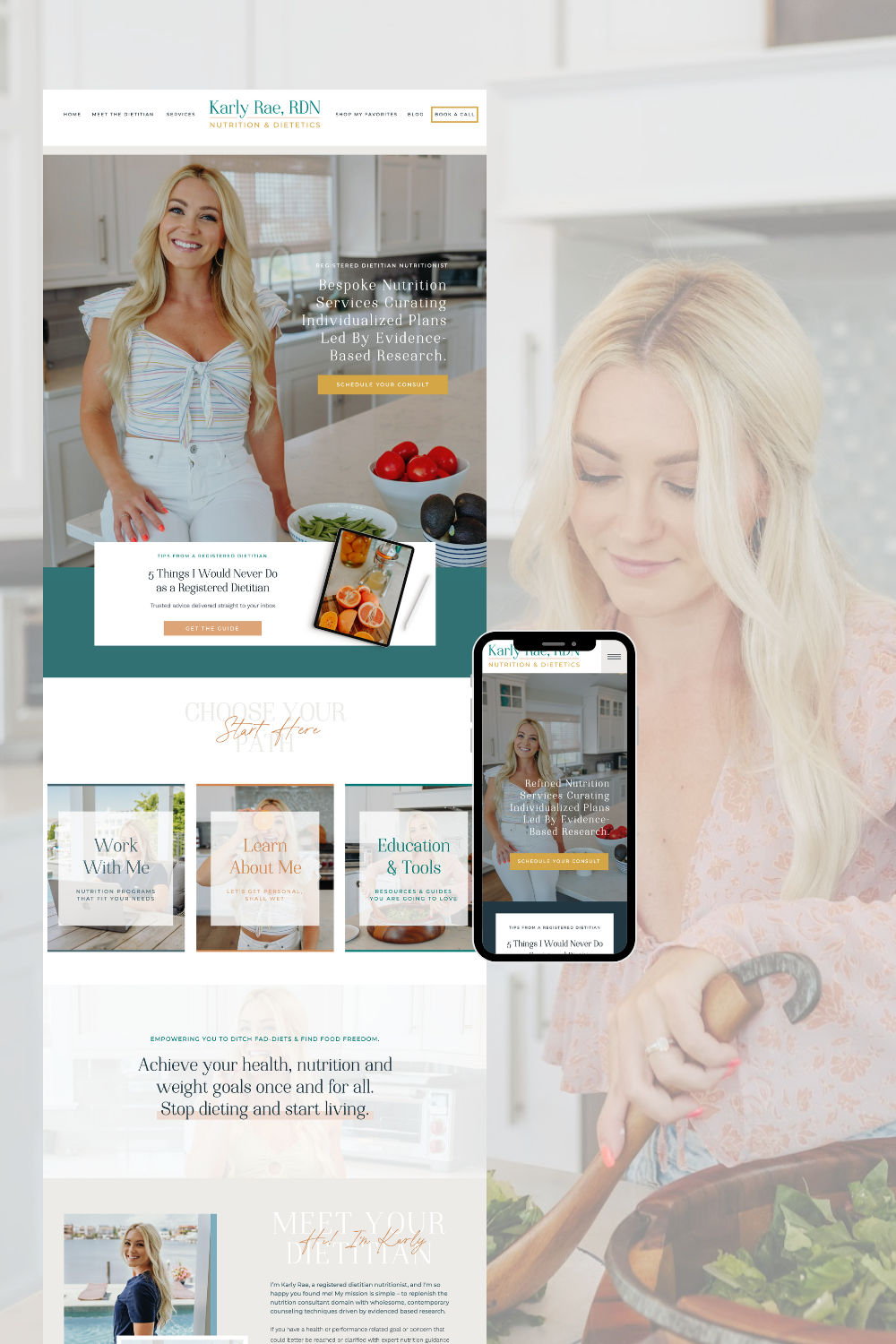
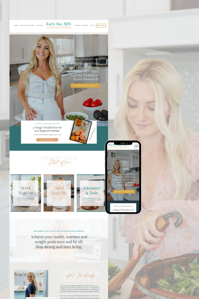
The website design for Karly Rae, RDN, perfectly blends a professional and approachable vibe, capturing her expertise in nutrition and dietetics.
When it comes to creating a professional yet approachable online presence, the website design for Karly Rae, RDN, is a prime example of how to balance style and functionality. Karly is a registered dietitian with a passion for helping clients achieve their health goals through personalized nutrition plans, and her website needed to reflect her evidence-based, client-focused approach. Let’s take a deeper dive into how this Showit website design came to life.
The Vision
Karly’s vision for her website was clear: she wanted a space that was not only visually appealing but also conveyed trust, expertise, and a welcoming spirit. The goal was to create a design that felt fresh and modern while maintaining a sense of warmth and approachability—something that would resonate with her diverse clientele. By focusing on a calming color palette of teal, greens, and neutral tones, we crafted a digital space that feels inviting and professional.
A Captivating First Impression
The homepage is where first impressions are made, and we wanted Karly’s website to leave a lasting one. The design starts with a striking hero image of Karly herself, radiating confidence and warmth. This personal touch immediately builds a connection with visitors, letting them know there’s a friendly face behind the expertise. Alongside the image, the hero section includes a powerful headline and a clear call-to-action, encouraging visitors to schedule a consultation or explore her services right away.
Organized and User-Friendly Navigation
One of the main priorities was to ensure the website was easy to navigate. The clean, minimalist layout guides visitors seamlessly through Karly’s various offerings. The navigation menu is straightforward, with links to key sections like “Work With Me,” “Learn About Me,” and “Education & Tools.” Each section is strategically designed to provide valuable information without overwhelming the user, making it simple for potential clients to find exactly what they need.
Showcasing Services & Expertise
Karly’s website does an excellent job of highlighting her wide range of nutrition services. The “Work With Me” section is beautifully laid out, featuring her programs and packages in a way that’s both visually engaging and easy to understand. Each service is accompanied by a brief description and a call-to-action button, encouraging visitors to take the next step towards working with her.
We also incorporated a section dedicated to client testimonials, which plays a crucial role in building trust with new visitors. The testimonials are presented in a rotating slider format, allowing Karly’s happy clients to share their success stories in their own words. This not only adds credibility but also showcases the positive impact of Karly’s personalized approach.
Educational Blog for Added Value
Another standout feature of Karly’s website is her blog, which serves as an educational resource for current and potential clients. We created a visually appealing blog layout that’s easy to navigate, ensuring visitors can quickly find articles that interest them. The blog covers a variety of topics, from managing specific health conditions through diet to practical tips for mindful eating, aligning with Karly’s mission to empower her audience with evidence-based knowledge.
A Personal Touch with “About Me”
In the “About Me” section, we wanted to highlight Karly’s journey and expertise in a way that felt both professional and personable. This section includes engaging photos of Karly in her element—whether she’s consulting clients, preparing nutritious meals, or simply enjoying life by the water. By blending professional achievements with a touch of personal storytelling, we created a space that allows visitors to connect with Karly on a deeper level, fostering trust and relatability.
Building Connections with Calls-to-Action
Throughout the website, we strategically placed calls-to-action (CTAs) to encourage engagement. Whether it’s booking a consultation, signing up for a freebie, or exploring the blog, each CTA is thoughtfully designed to guide visitors towards taking meaningful actions that align with their needs. The bright, contrasting buttons stand out against the softer background colors, making them easy to spot and click.
Mobile-Responsive Design
In today’s digital age, it’s essential for websites to be mobile-friendly, and Karly’s site is no exception. The entire website was designed with a mobile-responsive approach, ensuring that it looks and functions beautifully on all devices, whether viewed on a desktop, tablet, or smartphone. This adaptability ensures that Karly’s clients can access her services and content on-the-go, without any compromise in user experience.
Final Thoughts
The website design for Karly Rae, RDN, is more than just a digital presence—it’s an extension of her brand, her mission, and her passion for helping others achieve their health goals. By combining a clean, modern aesthetic with functional elements that enhance user engagement, we’ve created a website that not only looks great but also supports Karly’s business growth.
If you’re a nutritionist, dietitian, or wellness professional looking to elevate your online presence, this design serves as an inspiring example of how to balance professional expertise with a personal touch. The end result is a website that truly reflects Karly’s commitment to empowering her clients through evidence-based nutrition and dietetics.
You can check out Karly Rae RDN’s website design here!
