Inquire NOw
let's work together
LAURA SNYDER
serving small businesses throughout the U.S.
Based in Southern New Jersey
Sunkissed by Kat

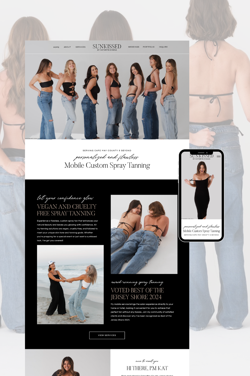
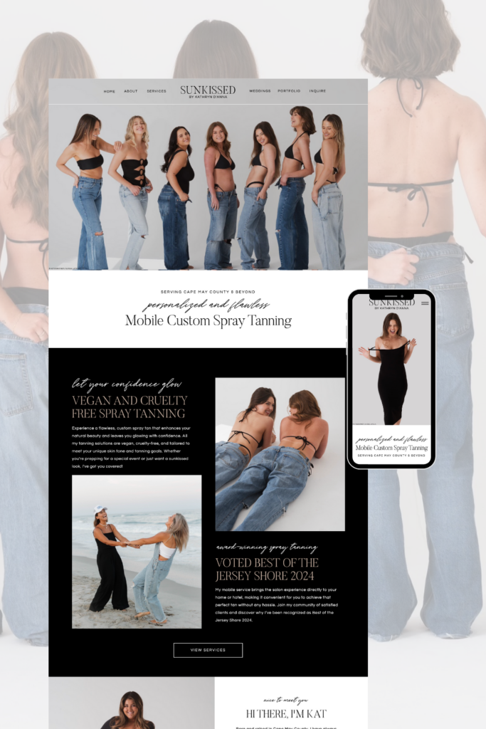
The website design for Sunkissed by Kat is modern, sleek, and radiant, capturing the essence of a sun-kissed glow with a touch of sophistication.
The website design for Sunkissed by Kat is modern, sleek, and radiant, capturing the essence of a sun-kissed glow with a touch of sophistication. The site blends clean, neutral tones with bold, black accents, giving it a fresh yet professional feel that complements Kat’s brand as a mobile spray tanning specialist.
Key Features:
- Hero Section: The homepage opens with a striking banner featuring Kat and her clients, exuding confidence and joy. The headline “Personalized and Flawless Mobile Custom Spray Tanning” immediately communicates the service’s exclusivity and quality.
- Elegant Typography: The site uses a mix of script and sans-serif fonts, which add a balance of personality and readability. The script font in particular conveys elegance, giving the brand a luxe, boutique-like feel.
- Highlight on Vegan & Cruelty-Free: There’s a dedicated section for Kat’s commitment to vegan and cruelty-free spray tanning products, appealing to environmentally conscious clients and adding a layer of trust and authenticity to her services.
- About Section with Personal Touch: The “Hi There, I’m Kat” section introduces the founder in a relatable, friendly way. A photo of Kat herself, paired with a personal bio, builds a connection with visitors, showing her passion and expertise in beauty and tanning.
- Portfolio Section – “Explore My Past Work”: This visually appealing gallery showcases Kat’s work with various clients, from beachside brides to editorial shoots. The layout is clean and organized, allowing each image to stand out and giving potential clients an immediate sense of Kat’s skill and style.
- Client Testimonials: The site includes testimonials that highlight Kat’s personalized approach and attention to client needs. This social proof adds credibility and reinforces her reputation as a top choice for spray tanning.
- “Are You Ready?” Call to Action: The website ends with an enthusiastic call-to-action, inviting visitors to experience the confidence of a sun-kissed glow. The bold text and high-quality imagery reinforce the feeling of beauty and empowerment that Kat’s services promise.
- Footer with Quick Links and Social Media: The footer ties everything together, offering easy navigation links, accolades (like “Best of Jersey Shore”), and a gallery of Instagram images that showcase more of Kat’s work and her vibrant personality.
Overall, the Sunkissed by Kat website embodies professionalism, warmth, and an elevated beachy aesthetic that mirrors the experience Kat provides through her mobile spray tanning service. It’s inviting, user-friendly, and clearly communicates the brand’s focus on natural, radiant beauty.
See it live at sunkissedbykatnj.com!
